February 4, 2015
Who would imagine that a typeface could be the source of lawsuits, treachery and sabotage? Well, that’s exactly what happened 98 years ago with the Doves Typeface. In its day, Doves Type was highly prized and was used to print some of the most famous books of the Edwardian era. However, because of a bitter battle between the business partners who created it (Thomas Cobden-Sanderson and Emery Walker) it ended up being hurled in the London Thames from Hammersmith bridge under cover of darkness.
When the partnership between the two businessmen ended acrimoniously, it was agreed in a settlement in 1909 that the older man, Cobden-Sanderson, could keep the Doves Type, but that it would, on his death, pass to Walker. Years later, and in a bid to prevent Walker from ever inheriting the typeface, Cobden-Sanderson threw the entire typeface into the murky depths of the Thames.
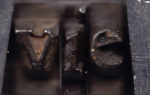
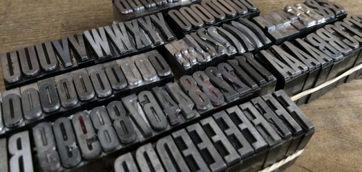
The story of the lost font is all the more tragic when you consider just how painstaking the process of typeface production used to be. Back before the digital age, a new typeface would start life as rough drawings of each character – including all the different font sizes and weights. A punch-cutter would engrave the interpretation of these sketches in metal, before the ‘punches’ were pressed into a softer material from which the final piece of type would be cast. It is astounding to realise this process would take more than two years.
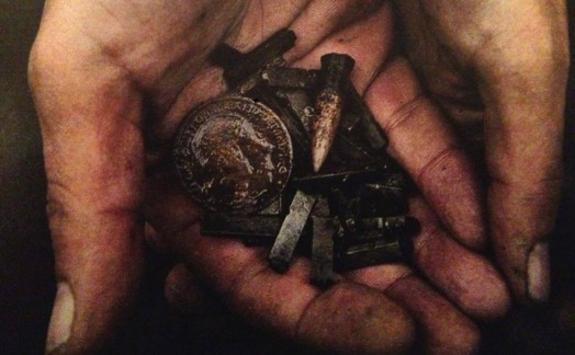
A search for the valuable typeface was recently spearheaded by @Robert Green, a designer who, prior to organising the trawling of a small section of the Thames for the actual metal pieces, researched and redrew the typeface, making it available for digital download for use on any phone or computer. Unbelievably, 150 pieces of Doves Type have been recovered during Green’s search, but this represents only a tiny part of what was lost.
Here at Noted in Style, we only have two typeface; the classic Gill Sans in 18pt and a 48pt condensed slab face that we rescued from an ’emporium of everything antique, old fashioned and unusual’ (Scotts in Margate) – perfect for letter pressing names or initials onto notebooks.
A new updated electronic version of Doves Type® is available to buy here.
Doves typeface photos from The Doves Type Facebook page