November 2, 2015
Directors Cut – written by Gerald Glover (lstd)
Just like handwriting, typeface choices say a lot about a personality. This is just as applicable to brand or corporate personality as it is to individuals. It is therefore incredibly important for brands to select their typeface carefully to portray the right image and it’s why companies spend thousands on type and typography.

In essence, the role of a typeface is to create a personality within communication, providing another level of connection between the brand and the viewer, customer and or consumer. As Sarah Hyndman, typographer comments:
“We’re all typography consumers. Type helps us to navigate and make choices”
“Fonts turn words into stories… powerful brand stories”
“They are like clothes – they create a first impression.”
So what does this mean for brands?
Brands need to think carefully about what typeface they choose to ensure they convey the right message to their audience.
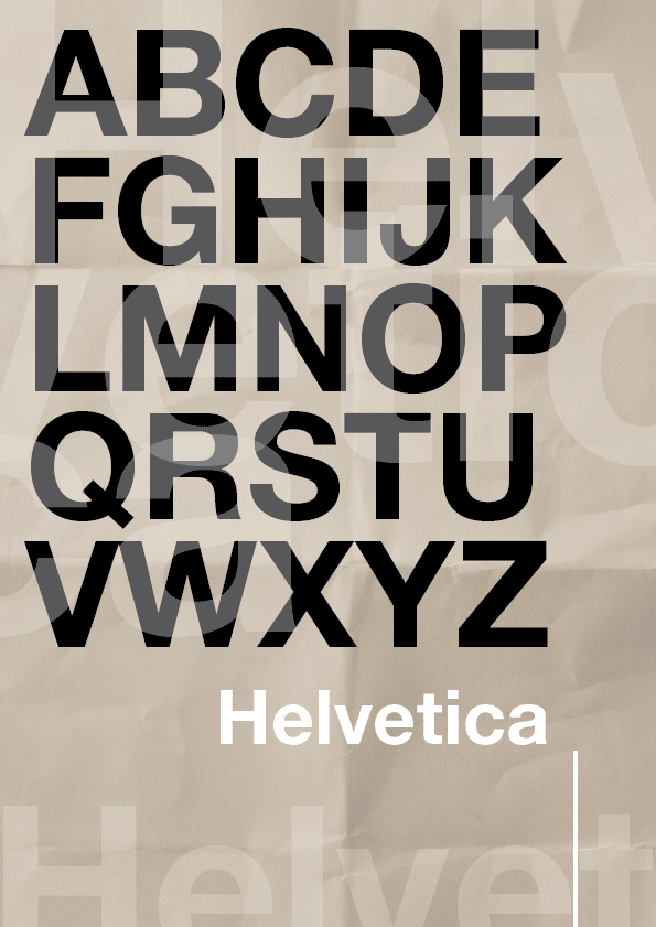
Helvetica with it’s clean, readable, block format is associated with the art and design movement. Heavily influenced by Swiss typographers in the 50’s and 60’s it’s become one of the most popular fonts of the 20th century. Being legible, precise and neutral it can work well in certain applications, but on the flip side, being neutral also means it can look bland and be regarded as the ‘beige’ of typefaces. Beige however to some companies will translate into safe and reliable.
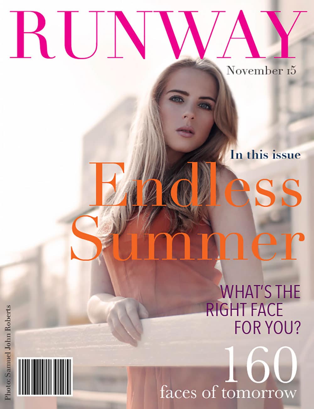
In contrast Didot, named after the French printing and type producing family it originated from, takes inspiration from Englishman John Baskerville and his experimentation of stroke, contrast and condensed armature. Didot’s high contrast is described as neo-classical and evocative of the age of enlightenment. Due to the contrast of thick and thin the visible weight of the letterform is greatly reduced, thus making it perfect for overlaying onto photographic imagery, like magazine covers. Didot is now heavily associated with the fashion world, thanks in part to it’s heavy use by Vogue and Harper’s Bazaar.
Due to associations and heavy pictorial references a typeface can automatically give you an impression of the company behind the text, indicating to you if it is an artisan company, blue chip corporate, creative agency or perhaps a legal firm.
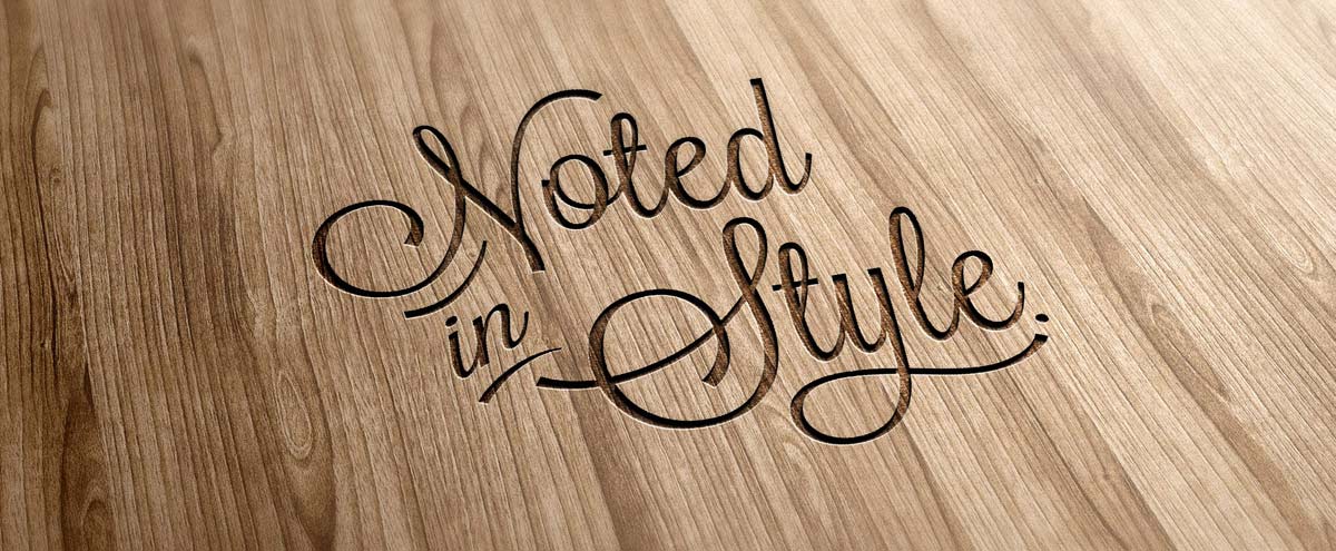
Here at Noted in Style we experimented with various typefaces for our logo which included a mix of both serif (a slight projection finishing off a stroke of a letter) and Sans Serif (without projections). Initial sketches included fonts shapes based upon Baskerville, Branboll before settling on Lavanderia. Certain letters were then tweaked to create our current logotype. We wanted to create a soft, approachable and somewhat craft inspired look that lends itself to the hand-crafting and finishing we specialise in.
To get a better picture of just how conditioned we are in knowing what a particular font depicts, watch Sarah Hyndmans video below.
Sarah Hyndman is an expert in multisensory typography. She is the founder of Type Tasting, an experiential type studio, and is the author of The Type Taster: How Fonts Influence You. Sarah’s video ‘Wake up and smell the fonts’ is from her TEDxBedford talk.
What does your typeface choice say about your brand?